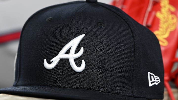
Every year, New Era, the official on-field cap of MLB, releases seemingly endless series of fashion caps, generally giving each of the 30 teams the same treatment with the club's logos. Their latest, the Overlap fashion caps really missed the mark for most teams, including the Atlanta Braves. However, the worst got rather inappropriate.
The design, which featured a team's primary home or away workmark set behind the primary cap logo did not end up having the desired effect. The Rangers cap looked like it included a vulgar spanish word, while the Astros and Angels just nearly avoided having vulgar words on their caps.
Thoughts on New Era’s latest drop? pic.twitter.com/s94qTVlAq9
— Jomboy Media (@JomboyMedia) March 10, 2025
New Era whiffs on new Overlap cap design
Let's start with the Braves version. Most of the time, these fashion caps aren't going set trends, but they're usually decent enough to wear without being embarrassed.
This version is an all navy cap, with the iconic A in navy. The Braves script sits behind the A, but since it's in red, the wordmark's stands out a little more than some of the other caps. Unfortunately, with the V obscured by the cursive A, the wordmark either reads BRA ES, or BRAAES, depending on how well you can spot the navy A.
It's hard to believe that this cap design is actually one of the better ones from the series, but it is. Only the Chicago Cubs cap actually maintains the same word when the cap logo is overlapped with the word mark.
While other caps just create gibberish words, like "Braaes" or "Mmmi", other caps create words that look quite close to something rather unfriendly. The Los Angeles Angels cap reads "AnAels", with the E saving the cap from being vulgar. The Houston Astros cap reads "AsHos", which sounds very similar to another word when said aloud.
However, the worst offender is the Texas Rangers, as the capital T from the cap logo falls right in the middle of the Texas wordmark, replacing the X.
In English, "TeTas" doesn't mean much. In Spanish, it is vulgar, resulting in the cap being taken off from shelves.
This isn't the first time in the last year that New Era has missed the mark with their fashion caps. Just last season, they had a design which featured the team's cap logo being repeated multiple times across the front of the cap. Unfortunately for the Athletics, their cap read "ASS".
We're not sure who keeps approving these, but if you're a fan and you see these in the wild, you might be able to make a quick buck.
