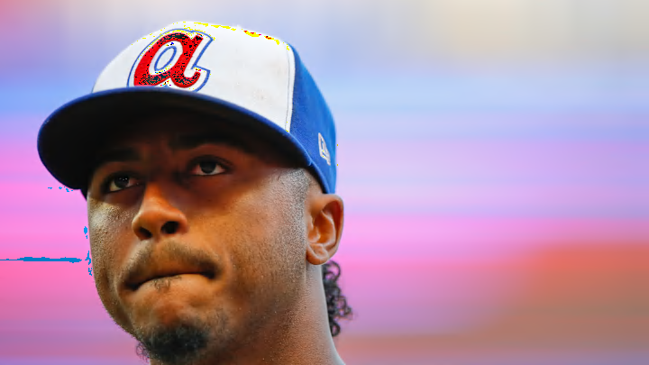
The Atlanta Braves are entering their 60th season in Atlanta, and during this run, the team has worn numerous cap designs.
While some have been iconic, like the lowercase A associated with Hank Aaron and their navy crowned, red-billed cap that's been worn for the last nearly 40 years, others have been unforgivable, or at least forgettable.
We scanned the Braves' uniform history and found the three best and two worst designs in franchise history
The worst cap designs in Braves history
The City Connects

Released in 2023, the uniforms pay homage to the 1970's uniforms associated with Hank Aaron's 715th home run. The club brought back the white front panel cap, replacing the iconic red lowercase A outlined white and blue with a blue uppercase A outlined in white and red.
While the original cap popped with the red A, the city connect cap's logo gets muddled. Despite trying to provide a respectful nod to the past, this cap simply has us wishing that they just brought back the original set.
1981-1984 home cap

Right after dropping one of the most iconic hats in franchise history, the club decided to bring back the uppercase script A, but keep the royal and red color scheme.
Atlanta released two versions, an all royal cap with a white A, and an all royal cap with a white A outlined in red.
The latter cap was designated as the home cap, but after four seasons, the club ditched it and wore the non-outlined cap at home and on the road.
The problem with the red outline, unfortunately, is that it added a fuzziness around the logo. While the away cap had a clean look to it, this one missed the mark. Apparently the team agreed, scrapping the cap and going with the non-outlined design for the following three seasons.
The best cap designs in Braves history
World Series gold outline

While some champions have scrapped their colors to accommodate for their gold commemorative championship uniforms, the Braves opted for a simpler design.
Instead of going overboard, the team added their World Series patch and a gold outline to the upper case A. It worked out perfectly as a subtle yet elegant ode to their 2021 World Series victory.
The Braves navy and red cap

As they say, "If it ain't broke, don't fix it." For the last 38 years, the Braves have worn the navy crown, red bill cap with the iconic uppercase script A.
Originally a part of the inaugural Atlanta Braves uniforms, the club scrapped it for an all navy cap in 1970, but returned 17 years later when the team brought back the the uniforms the club still wears to this day.
The team has won their two championships in Atlanta with this cap design and it's hard to see it going anywhere anytime soon. The only complaint I have is that it's not worn enough. Since 2009, the team hasn't worn the cap on the road.
Hank Aaron era

Despite the iconic status of the current cap, the Hank Aaron era lowercase A, introduced in 1972, has a stronghold on the fanbase, and for good reason.
Aside from being associated Hank Aaron's record breaking homer, the cap has stood the test of time from a time when panel caps were abundant. The white panel allows the big red A to pop, while the royal blue bill and side panels complement the emblem.
While the original design only lasted eight seasons, it has been the de facto throwback option for the Braves (at least until Nike decided to limit how much the team could wear the throwback) because of the popularity it has with fans, which has extended the cap's lifespan.
Though the City Connect caps tried to recreate the magic of this era, it can never come close to being able to match the aura of the original design.
