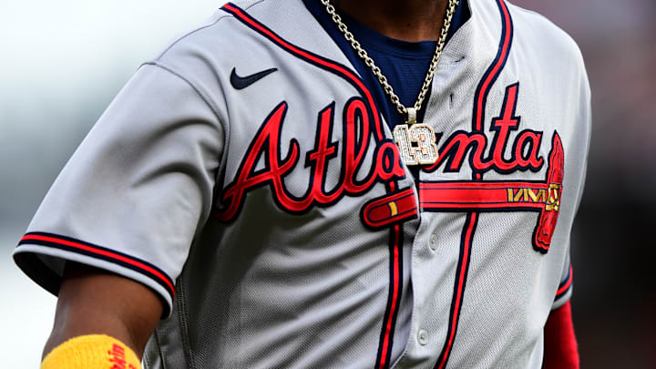
One of the growing trends in all sports that the Atlanta Braves had mostly avoided up until now has been the placement of sponsor patches on team uniforms. At least nine different MLB teams had sponsor patches somewhere on their uniforms going into the 2023 season. Look, we get it: that is prime real estate that can generate revenue and given what has passed as an acceptable stadium name these days, who are we to argue?
You can now add the Braves to the list of teams that will have a sponsor patch on their uniforms and the result is...well, it is not great.
— Atlanta Braves (@Braves) May 18, 2023
Per a press release from the team, the Braves are partnering with Quikrete for the next five season on the sponsor patch which will be displayed quite prominently on the sleeve. Quikrete is headquartered in Atlanta and the team has worked with them in the past, so continuing that business relationship makes sense. The uniforms will debut on the field on Friday, May 19th against the Mariners.
So just how bad is the Braves' new sponsor patch?
First, the good. Of all the color schemes, gold isn't the worst. While it would certainly be better/less jarring if the patch was in line with the Braves' team color scheme, the Braves' gold collection after the 2021 World Series title looked nice and while this isn't THAT, at least it isn't something super off the wall (plus it does kinda match Ronald's sleeves). This is also promoting a locally headquartered company which is a nice touch instead of some crypto scam that is probably going to result in indictments in a few years.
However, woof....these things stand out like a sore thumb which is probably great news for Quikrete because everyone is going to notice these things, but less great for the rest of us that have to see them. It is a large, chunky patch promoting concrete of all things. It's hard to find a sponsor that has a brand that both looks good and feels like it should be a sponsor of a team, but this one is particularly out of nowhere.
That said, there are worse examples out there in the sports world. The Cincinnati Reds' all red and white uniforms featuring a blue Kroger logo on them comes to mind (although they at least had the decency to make the background of those patches white). The Mets' having a giant red New York-Presbyterian logo on it that looks like it was generated by ChatGPT is up there, too.
